
Color Studies – Color Applications and Definitions
© 2012 – Sheri Doty
- The three properties of color
- The Color Wheel
- Influences of the Environment on Color Aerial Perspective and Intuitive Space Optical Color Mixing and Light Logic
- Color Relationships
- Color Schemes
- Color Applications
Part 1 – The Three Properties of Color

Local Color:
The actual identifying color of an object perceived in ordinary daylight. This also refers to the intrinsic color of an object as we see it. Grass is green, and bananas are yellow. Local color reinforces any preconception we have of an object’s color.
The three properties of color: Hue, Intensity and Value
Color Property refers to a trait or attribute of a color or its characteristic quality.
1- Hue
A hue refers to a color’s name – red, blue, green. A hue is said be cool or warm in “temperature.” Cool colors appear closer to blue on the color wheel while warm colors appear closer to yellow or red. The term tone or tonality is also used when describing allover hues and values.
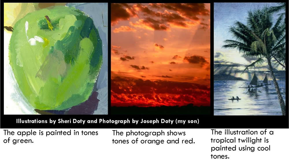
Tone or Tonality
- A quality of a color or light and dark values.
- Variations in the dimensions and brightness of a hue may be referred to as tone. The apple painting sketch has several tones of green.
- A hue is said to have warm or cool tones.
- If a blue hue dominates all other colors in a painting, blue describes the tone of the painting.
2- Intensity
Regarding art and artist’s pigments, intensity describes the purity of a color in terms of vividness or dullness. (The word saturation is synonymous with the word intensity.
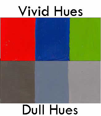
High Intensity: High Intensity Hues are unmixed or the least mixed colors. A high intensity hue is a vivid unmixed pigment.
Low Intensity: Low intensity colors are mixed hues such as tints and shades. A weak or low intensity hue is a mixed pigment that appears dull.

What is a high intensity hue?
A pure, unmixed hue is a high intensity hue.
What is a low intensity hue?
A low intensity hue is a dull hue that has been mixed with many colors. Color mixtures can also include black and white. The more colors are mixed the less vivid is the quality of a hue.
What is a Tint?
A tint is a hue mixed with white.Tints are also call pastel hues.
What is a Shade?
A shade is a hue mixed with its compliment, black or any combination of each.
What is a Tinted Shade?
A tinted shade is a shade mixed with white.
Do not confuse Intensity contrast with value contrast. Both High intensity hues and low intensity hues can be either dark or light in value, as shown in this intensity Scale.
Chroma
Chroma is a term meaning color and/or the quality of a color combining hue and saturation. It also describes the vividness or dullness of a hue. Because the term “chroma” is used synonymously with the word “hue” and “saturation” the term chroma can be confusing. I prefer to use the word “intensity” to describe the vivid or dull characteristics of a hue to avoid confusion.
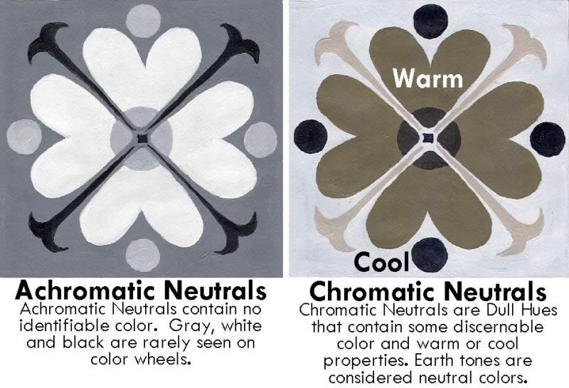
Achromatic Neutral
Achromatic Neutral refers to neutral gray tones from black to white with no discernible color or hue.
Chromatic Neutral
Chromatic Neutral refers to neutral tones with some warm or cool properties and recognizable but undetermined hue.
3- Value
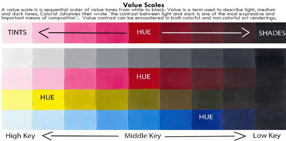
Value refers to the lightness or darkness of a hue in relation to white or black. As an example, yellow is a “High Key” value or is closer to white. A dark hue such as violet or blue is a “Low Key” value and is closer to black. Scales of values can be described in a chart showing several distinct gradations. The term “Brightness” is also used when referring to a value scale.

Brightness
Brightness is a dimension of color referred to on a scale running from bright to dim. The term “lightness” is similar to “brightness” in reference to an opaque value scale. When colors are transparent the scales range from black to clear. The term “Brilliance” can be used to describe a quality of color that combines saturation and brightness.

This value scale illustration is an example of a transparent wash of tones ranging from black to clear.
Part 2 – The Color Wheel
A Color Wheel is merely an arrangement of hues in a circle that is illustrative of an organization of colors. The color wheel is a tool by which a practitioner can study color mixing, color properties and color harmony.

It was Sir Isaac Newton who made the first color wheel designed after the natural spectrum of a prism or rainbow. By dissecting light through a prism of glass, the colors of light fanned out in a band of light waves lengths named violet, indigo, blue, green, yellow, orange and red. He placed these colors into a circular ring which was divided into seven unequal parts. He placed white in the center of the ring because he said all colors were to be found in a white light. His theory of color was the basis for future studies of colors in a wheel.
Since the introduction of Newton’s color wheel based on systematic color in a closed ring of color hues in 1666, there have been a variety of color wheel experiments.
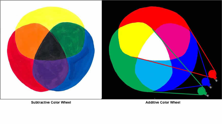
The Subtractive Color Wheel
The subtractive color wheel deals with the mixing of pigments. When you mix colors using high intensity primary color pigments, you are using the subtractive color method. Each time pigments are added to other pigments the color mix is less pure than the colors used to mix it making the color less intense or duller in intensity. When all three primary color pigments are mixed together, they make gray or black.
The Additive Color Wheel
The Additive color wheel deals with the mixing
of light. When equal amounts of a red light, a blue light and a green light are mixed together they produce white. Because a mixture of red, blue and green light make white, they are called the additive primaries.
Two Pigment Color Wheels Used in Art and Industry
There are two accepted versions of the pigment color wheel used as a standard in art and industry today. They both use twelve hues, but the primary colors and color placement on the two color wheels are different. The “old” or Traditional Color wheel is based on the Red, Yellow and Blue primary color set. The “new” or “Element” color wheel uses Magenta, Cyan and Yellow as primary colors.
The Red, Yellow and Blue primary color system was first recognized in circa 1731. The Traditional color wheel is the most widely taught study of color today using Johan Itten’s color harmony and contrast theories. Itten’s book The Elements of Color refers to color relationships that form a basis for composition. The Magenta, Cyan and Yellow primary color system was introduced in circa 1855 when Itelm Holtz published his theory of the additive laws of colored light and the subtractive laws of colored pigment. The new color system evolved from developments in chemical colors and processes. The color printing process and photography are based on the new color wheel.
Hue Relationships on the Color wheel
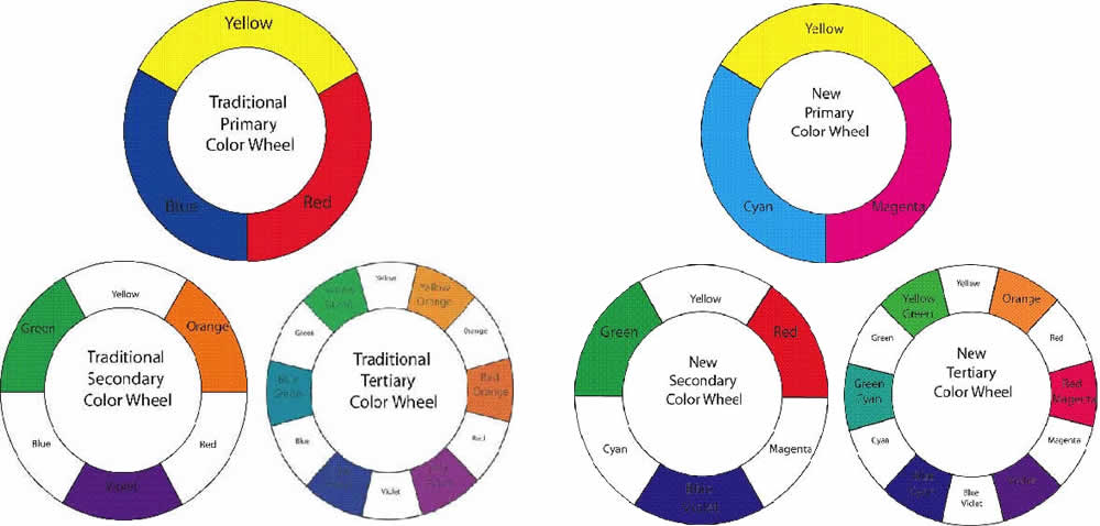
- Primary Colors: Primary Colors are three intense pigments that can be colors, yet cannot produce themselves satisfactorily.
- Secondary Colors: Using the three primaries, three secondary colors are produced by mixing equal parts of the two adjacent primary colors.
- Tertiary or Intermediate Colors: All additional hues that fall between the primary and secondary colors are called Tertiary or Intermediate Colors. Tints and shades may also be referred to as tertiary colors.
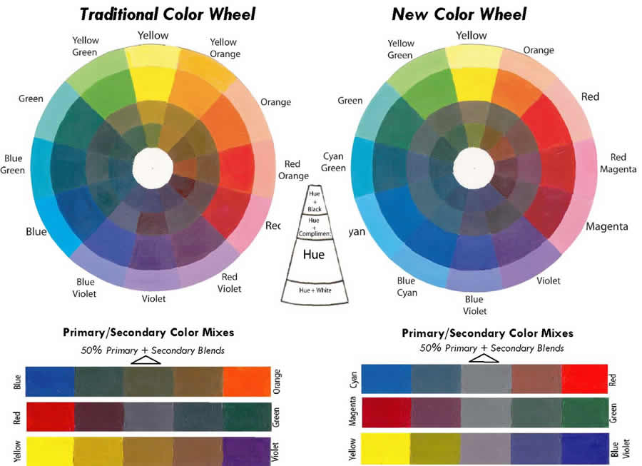
Many artists argue that the “New” color wheel is more correct in color placement than the “Old” color wheel. Their reasons are that the hue placement “New Color Wheel” helps the artist make accurate color mixtures and that true complimentary colors should make a perfect neutral gray when mixed at a 50% ratio.
Hue relationships on both color wheels can be interchangeable. Both color wheels have three primary colors, three secondary colors and six tertiary colors.
These two color wheels may differ in color placement but the properties of color, color harmony and contrast remains consistent. Color theories continue to evolve and change with artistic and scientific advancement. I believe that experience through experimentation with the properties of color remains a reliable means by which an artist learns his or her craft. Espousing only one theory limits the serendipity of discovery.
Part 3 – The Influences of the Environment on Color
Terms and descriptions used to explain how the environment influences color
Optical Color
Optical Color refers to how color is influenced by the environment. Optical color changes are influenced by a range of variables including atmospheric conditions, reflective characteristics and lighting affects each of which change the visual impact of the “local color” of objects.
Aerial or Atmospheric Perspective and Intuitive Space
This method of creating space is using illusion to create depth. Intuitive space is sensed or ”felt” on a two dimensional plane. Intuitive methods of space control include overlapping, transparency, and other applications of spacial proportion.
Atmospheric Conditions: Such as the density of humidity, dust or fine particulates floating in the atmosphere and pollution affect the rate of texture, tonal, color and fading and diminishing detail.
The artist can use environmental influences to create the illusion of deep or infinite space. The term Aerial Perspective was first attributed to Leonardo da Vinci. He determined how a landscape seemed to change through atmospheric influences. Atmospheric perspective is the method of creating the illusion of depth, or recession, in a painting or drawing by modulating color, value contrast and textual effects to simulate changes effected by the atmosphere. Although the use of aerial perspective has been known since antiquity da Vinci named this phenomenon Aerial perspective.
The artist can enhance the illusion of deep or infinite space by using four contrasts:
- Intensity Contrast
- Value Contrast
- Textural Contrast
- Diminution or Size Contrast
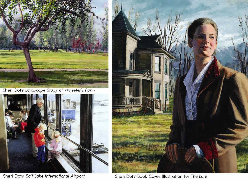
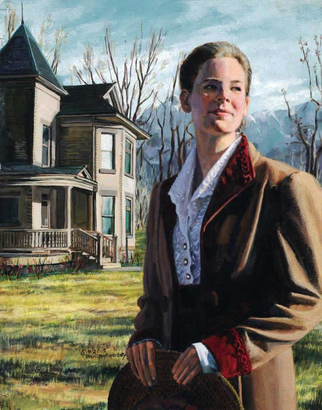
Intensity Contrast: Intense colors are seen in the objects closest to the viewer. Dull or low intensity colors are viewed in the distance. Because colors are absorbed by the atmosphere, color seems to dim in contrast and intensity as they fade into the distance. As an example, I might paint a red mailbox that is three feet from me using vibrant fiery reds. That same red mailbox might be painted rusty red tones in the middle ground. When viewed from a distance, the red mailbox may be painted with a dull warm tone. Colors seem to fade in this progression. Reds and yellows disappear first, and other colors seem to fade away leaving a light blue in the distance. This is the usual progression unless the sun is near the “earth’s” horizon at dawn or sunset, when the landscape is flooded with scarlet and gold.
Value Contrast: Extreme value contrast is seen in the objects closest to the viewer. Values are absorbed by the atmosphere causing light and dark tones to dim in contrast and, and fade into the distance.
Textural Contrast or Sharp and Diminishing Detail: The human eye cannot see everything with equal clarity. Close Objects appear sharp and clear in detail, while those objects seen at a great distance appear blurred and lacking definition. The closer you are to an object, details are clear to see. The farther you move away, objects and details are fuzzier and less distinct. From a distance you see less texture but more of a pattern or a simple tone. No matter how complicated the details of an object, it will become less noticeable as it recedes into the distance.
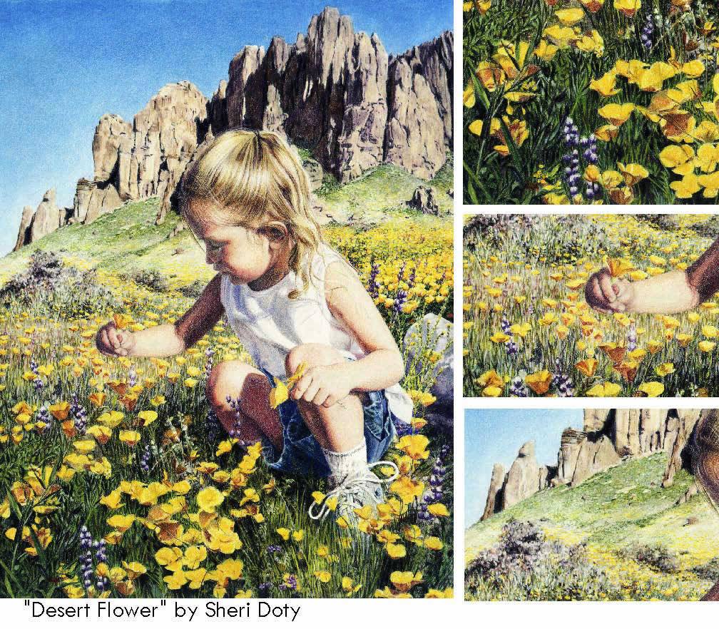
Close up – The details of vegetation such as leaves and flowers in foliage are clear to see. Rendering the details of architecture such as windows, doors and bricks create a building’s character.
Middle distance – As you move farther away, the tactile quality of foliage details become a pattern of textures, scribbled lines and tones. Atmospheric perspective effects might cause buildings, concrete and brick surfaces to gradually disappear to become an undefined visual texture.
Far distance – The distant background becomes a textural pattern. The awareness of individual characteristics shifts to group awareness. Instead of making textural marks smaller, the artist begins to deal with mass and the suggestion of texture
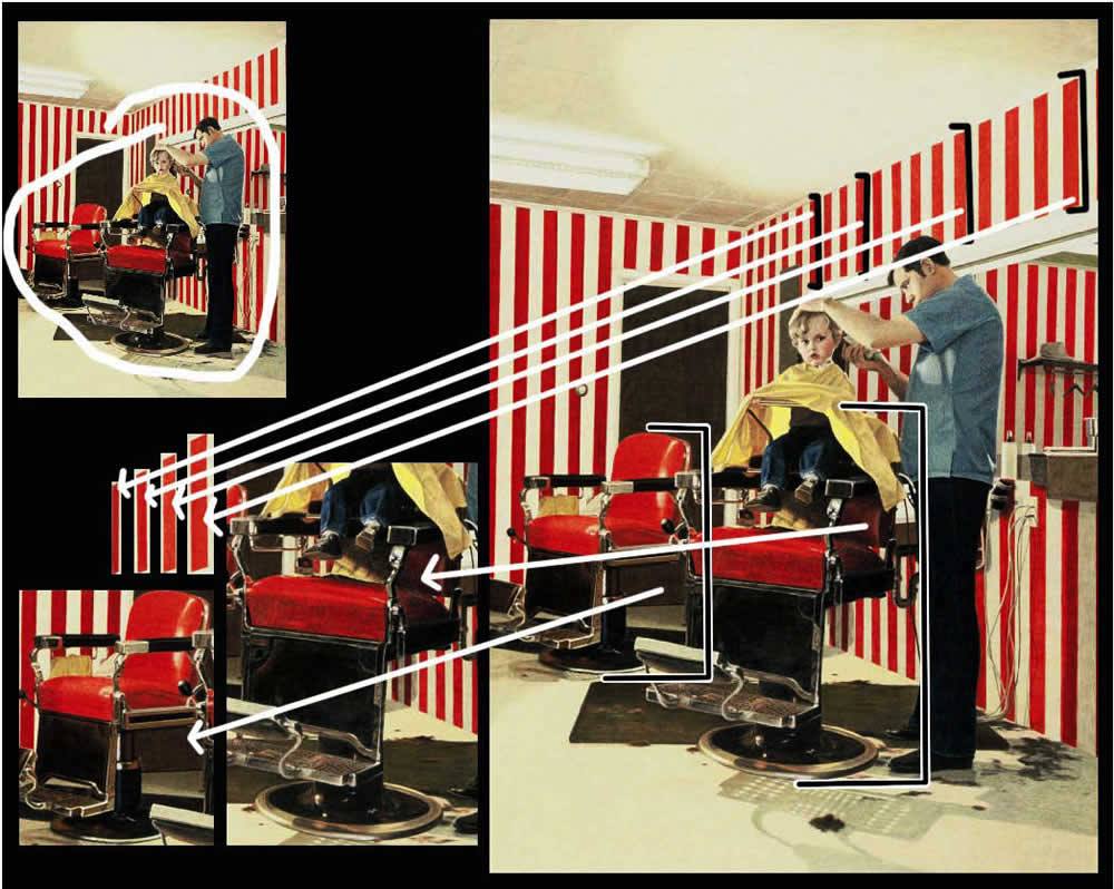
Diminution or Size Contrast and Overlapping Figures: Same sized objects appear smaller or seem to reduce in size as they recede into the distance. Overlapping Figures also gives a sense of depth.
Optical Color Mixing and Light Logic
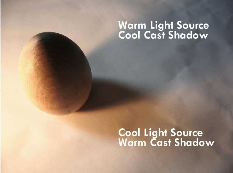
A light source has warm or cool properties.
Light Source and Cast Shadows
- It has been documented that a warm toned light source casts a cool shadow, and a cool light source casts a warm shadow.
- As I was demonstrating this phenomenon to my students, we observed that the effect is enhanced when both light sources are present. The example on the right shows what we observed.
- The cool cast shadow came from a simple desk lamp. The light source provided a warm yellowish light which cast a cool – almost blue-violet cast shadow.
- The warm yellowish-orange cast shadow was caused by a cool light source – daylight coming from a north window in our classroom.
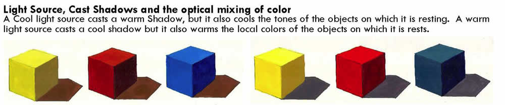
Colored Light Sources and Complimentary Cast Shadows.
While studying the book The Art of Color by Colorist Johannes Itten I was intrigued by his observation that a colored light source casts its opposite or complimentary color shadow. He describes an occasion when he was walking in a city at night after a snow storm. Neon lights were lighting the city street. As he was walking he looked down and observed colorful cast shadows at his feet. He discovered the colorful city light lights were casting complimentary cast shadows.
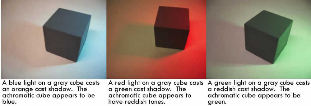
• I experimented with Itten’s observations and I came up with these examples:
Colored Light Sources and the Optical Mixing of Color
When I shined colored lights on varied objects their apparent colors were changed by an optical mixing of colored lights. The results were as follows: A blue light shining on a yellow cube appears green. The same blue light shined on a white sphere looks blue. Each of the following examples shows variations of this phenomenon.
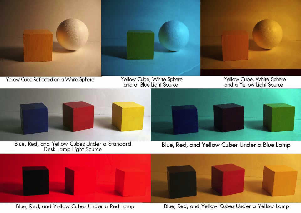
Reflected Light and the Optical Mixing of Color
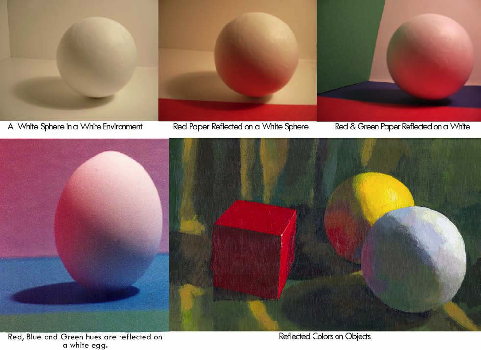
An object’s “Local Color” is changed by the reflection of colored objects nearby and the colors within the environment. All my examples are placed in a white environment and illuminated by an artificial daylight light source. As an example of no color reflections I show a white sphere, in a white environment. The other examples show how colors reflect onto white or colored objects. In my egg example, the white walls of the box also reflect the colored papers placed around the egg. When one object is near other object, the reflected colors may blend making a new color mix. Please note: colors can only be reflected onto form shadows and cast shadows. When a light shines directly onto an object there is no color reflection, the light shows the local or apparent color of the object. It is on the shadow side where light causes colors to be reflected back on an object changing the local color of an object making an optical color mixture.
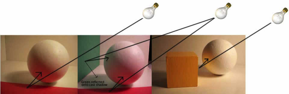
Notice how the light shines on the colored papers and yellow cube, then bounces back onto the shadow side of the white sphere.
Part 4 – Color Relationships
This section was taken from both Interaction of Color: by Josef Albers first copyright 1963 and The Art of Color by Johannes Iitten, First Published in 1961. I’ve also include my own observations of figure-ground relationships.
Note: I added this section to my study of color because it has had a major impact on my ability as an artist to make believable color and value choices in my art. If you want to study color relationships in depth I suggest you study and do the exercises in the books by Josef Albers and Johannes Itten.
Visual perception is a relative thing. Josef Albers, in his book Interaction of Color Revised Edition, said “In order to use color effectively it is necessary to recognize that color deceives continually.” Values are equally deceptive when one value figure is placed on different grounds. (“Value” refers to the use of light and dark tones.)
Figure-Ground Interactions and Deceptions
The Deception of Figure-Ground relationships has various causes and if you understand those contributory relationships you will have ways to recognize those visual tricks played on the eye of the casual viewer and as an artist, make use of their interactions.
What is Figure-Ground? A “figure” is an object, shape or tone placed on a background or “ground”. Figure-Ground is the condition in which backgrounds, tones or hues change the visual impact of the figure resting on it. The same hue or value appears to be unlike itself depending upon the contrast of tone or hue of the background upon which it is placed. Conversely, two different tones or hues appear to be the same when placed on contrasting grounds. Each will have an impact on how believable your art will be perceived by the viewer.
Value Contrast and Figure-Ground
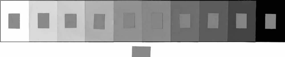
Most people have difficulty perceiving “figure-ground” relationships. When the same medium toned figure is placed on varied light and dark backgrounds, it will be perceived to be as a different value. Example: When a medium gray is placed on a near black background, the mid-gray tone appears very light. When the same gray tone is placed on a near white background, it is perceived to be very dark. But when a mid gray tone is placed on a similar value background, the contrast is minimal. Note how the same mid-tone value patch on the ten step value scale looks different when placed on each background value step of contrasting values
Figure-Ground Confusion and the Logic of Light and Shadow
When an artist wants to render the illusion of volume and mass on a two-dimensional surface, they use what is called “Light Logic “or the logic of showing a light side a dark side and cast shadows. When one light source shines on a sphere I say the dark side is “always” darker than the light side of an object and the light side is “always” lighter than the dark side. This sounds simplistic but it is the middle tones on both the light and dark sides of an object that confuse the artist’s eye in value relationships. The confusion between the light and dark values is caused by misreading figure-ground relationships. Values have a different appearance when placed on varied backgrounds. Establishing a definite light side and dark side makes round objects appear round and defines the form of an object accurately. Separate your dark tones from your light tones to avoid figure-ground confusion.
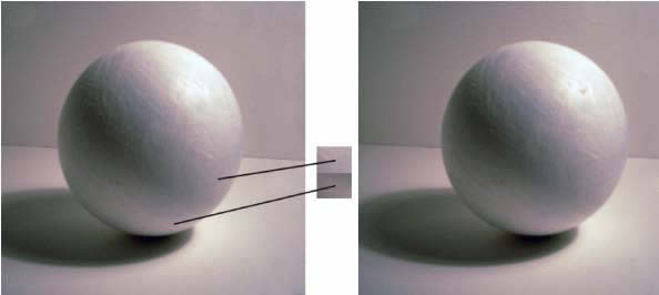
In this photograph I wanted to demonstrate Figure-Ground confusion as applied to Light Logic. I used one light source to show the light side, forming shadow and cast shadow of a white sphere in a white box. The darkest tone on the light side looks to be the same value as the lightest value tone on the light side. I have cut out value swatches from each area to show the true value of the tones showing figure-ground confusion.
Contrasting Grounds
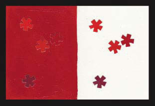
When four red shapes are placed on a white background, the red shapes are dominated by the white ground, but the contrasting properties between red tones is less noticeable because of the extreme contrast of the white background. When the same four red hues are placed on a red background the contrast of warm/cool properties and contrasting values become more apparent but the background contrast is subtle.
The reason Simultaneous Contrast effects are important to visual artists are explained by Johannes Itten.
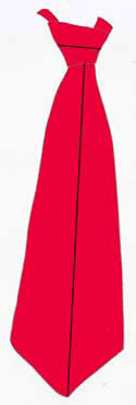
Simultaneous Contrast: “Simultaneous contrast results from the fact that for any given color the eye simultaneously requires the complementary color, and generates it spontaneously if it is not already present.” Johannes Itten, The Art of Color . Why the eye requires a color to be balanced by its compliment has not been explained. Simultaneous contrast affects figure-ground interactions due to this phenomenon.
Simultaneous Effects (Johannes Itten,The Art of Color page 88) “It is important to know under what circumstance simultaneous these effects will occur and how they can be counteracted. There are many problems in color that preclude solutions using simultaneous contrast. Some years ago, the manager of a weaving mill called my attention, in desperation, to some hundreds of meters of costly tie silk that would not sell well because a black stripe on a red ground looked, not black, but green. This effect was so pronounced that the customers insisted that the yarn was green. If brownish black yarn had been used, the simultaneous effect would have been neutralized, and heavy losses avoided.”
Simultaneous Contrast Demonstrations
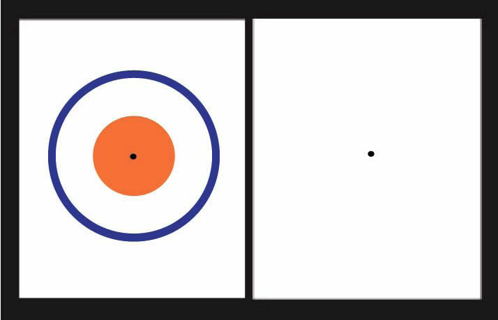
After Image is an example of complementary contrast Reversal . My example of a simultaneous after image phenomenon is seen at the right.
Stare at the black dot within the orange circle and blue ring for a long period of time- then stare at the black dot on the blank white page. You will see the reversed after image of a blue circle and an orange ring.
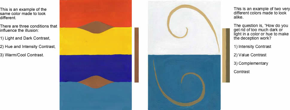
The following are my solutions to just two assignments from Interaction of Color by Josef Albers
My solutions to making the same color look different and two different colors look the same are accomplished by the following conditions:
Part 5 – Color Schemes
A Color Scheme is a select grouping of colors. Color Schemes can be made from the position of hues on both color wheels to produce Color Harmony.
Color Harmony
Color Harmony refers to a pleasing arrangement of parts offering visual interest and a sense of order.
Color Discord
A combination of unrelated and visually disturbing colors cause disharmony. Color discord can cause visual surprises that attract the attention of the viewer arousing an emotional response. A sense of unease is evoked in the viewer when discordant colors are used as a color scheme.
Direct Compliment – Complimentary colors are found at the opposite ends of the color wheel.

Split Compliment – Hues positioned on either side of the opposing compliment are called split compliments. Because a split compliment forms an Isosceles Triangle it can be called a triad.

Triad – Hues in an exact three way split on the color wheel make an Equilateral Triangle. The traditional primary colors of red, yellow, and blue are an example of a triad color scheme.

Tetrad or Double Compliment
Square Tetrad – Two pairs of equidistant complimentary colors that are at the points of a square.
Rectangular Tetrad – Two pairs of complimentary colors that are at the points of a rectangle.

Analogous – Analogous hues are located near or next to each other on the color wheel. Analogous hues are within the same range of color spectrum.

Analogous Plus Compliment

Monochromatic – Monochromatic describes variations of a single color in both value and intensity.

Part 6 – Color Applications
Color Applications in 4 Categories or Divisions. Symbolic, Mood, Subjective and Objective
Symbolic
Color has been used throughout the centuries to represent affiliations, loyalties, religion, mood and qualities.
- A. Affiliations: School colors, school uniforms, military decorations, etc. (In ancient Rome a red flag was a symbol for battle. In our lexicon a white flag is a flag of surrender.)
- B. Loyalties: A country’s flag, i.e., United States — white denotes purity, red denotes valor, blue denotes justice.
- C. Religion: The color of ecclesiastical vestments. Violet is the color of advent and lent. A priest wears black. In the middle ages brides wore green to symbolize fertility.
- D. Mood: Red with rage, “I feel blue.”
- E. Qualities: A blue ribbon represents the best or first place; if you are “true blue,” you are loyal and faithful; the colors of a country’s flag represent the qualities of her people.
Color and Mood
It is important to choose colors that will strengthen the design elements in your picture but do not detract from the mood you would like to evoke in the viewer. The same subject may bring into play different moods depending on the intensity and values of the colors you use.
People from tropical countries respond most favorably to warm colors; people from northern climates prefer the cooler colors.
Subjective Color Choices
“Subjective color” is a personal preference or personal thinking. You have your own personal or subjective opinion about which color combinations are harmonious. The psychological study of color also falls into the subjective category. Designers and sales people who are sensitive to color will be successful, if they do not impose their own personal color choices on the taste of their customers and clients.
“Arbitrary Color” is another term used for subjective color choices.
Objective Color
A study of color based on practical experience. From a rainbow of colors constructed within a color wheel, colors are mixed into a multitude of variations between black and white.
Sheri Lynn Boyer Doty CPSA -Biography 2010
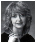
Sheri Doty received a B F A degree in 1972 from the University of Utah with a painting and drawing emphasis. Having experimented with non-representational styles during her student years, Sheri preferred classic realism as thought by professor Alvin Gittons. He and the professors, under whom she studied, emphasized strong drawing and painting skills. Sheri is a faculty member of Salt Lake Community College and Peterson’s Art center where she teaches Fine Art and Design.
Sheri’s paintings have earned her awards in regional, national and international art exhibitions and invitational shows including purchase awards and permanent museum acquisitions. Sanford Corporation has used her artwork to showcase its PRISMACOLOR colored pencil product line internationally. Sheri is a charter member and signature member of the Colored Pencil Society of America [C.P.S.A.].
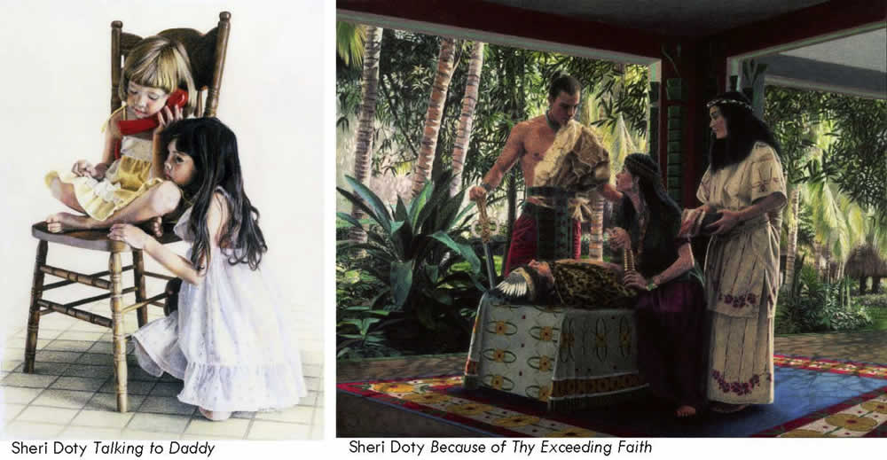
Sheri’s artwork has been published in numerous books including The Encyclopedia of Colored Pencil Techniques by Quarto Publishing, London England;Most of The Best of Colored Pencil series by Rockport Publishers, Creative Colored Pencil Techniques by Rockport Publishers, Creative Colored Pencil Portraits byri’s art work is included is Rockport Publishers and The Best of Portrait Painting by North Light Books, Dear Sisters by Covenant Communications Inc. Sheri’s artwork is published on book covers, in newspapers, periodicals, and exhibit catalogues.
People have been known to say, “She possesses a unique ability to paint the breath of life into her subjects – a gifted talent.” Because Sheri expresses not only the likeness of her clients but also their lifestyle, her portraits are in high demand. Sheri has also has prints and greeting cards on the market.
Sheri Says:
“The art professors under whom I studied had us draw and paint from live models and “open air” studies, not from photographs. To truly see and paint a subject, I need to see it from all angles. The human eye sees so much more than what is pictured in a photograph. I am glad of the rich ridged training I received from my teachers. I have married the use of photography and live studies to create my paintings. I take my own photographs as resource material employing a variety of ways to recreate what the human eye sees. My paintings are not exact reproductions, but an interpretation of life from my view as an artist.
“Thirty years of study and experience in this field has taught me that talent isn’t the reason for success in any endeavor. The keys to success are desire, perseverance and determination. But most of all, I depend on Father in Heaven’s influence. When I pray about what I paint, I can feel His help and guidance.”

Follow this link to visit Sheri’s website to view more of her work and to learn more about her.