About the Artist

Hello , my full name is Michael William Budden. I was born in Gosport, Hampshire, England in 1943. There were air raids, bombs being dropped all over the place. Entire streets were being destroyed while we huddled together with our brave mother in the air raid shelter at the bottom of the garden. My father was in the Royal Navy. There were 13,000 homes in Gosport at the time, and according to the Gosport records 12,253 had bomb damage or were destroyed and this didn’t include broken windows etc. The Naval and Military presence is the reason why Portsmouth and Gosport was hit so badly. It was this scenario that was to become my “playground”.
The earliest recollection I have in drawing was using a piece of chalk on a roof slate at the age of five. There was no paper in those days for children to draw silly pictures on. Everything was rationed. Wooden framed slate was used in school for writing on and it was not until the age of seven that I had the pleasure of writing in an exercise book at school. This could not be used for drawing though. Eventually notepads etc appeared in the shops and my doodling really took off. Having no one to teach me properly was a problem and my school had little or no interest in art. So, I had to go it alone and do my own thing and I have done ever since.
I am married to Sandra and have twins called Christopher and Mikala.
Following an injury that ended my Army career, I started to take my hobby more seriously. When concentrating hard I discovered it relieved pain – a form of meditation.
The landscapes, flora and fauna, old cottages etc of dear old Hampshire are my main interest.
I have held several exhibitions of my work, although not in recent years.
Visit Mike’s Website Below:
How to Draw the Chetnole Church by Mike Budden
How to draw: Using a photograph.
MATERIALS USED IN THIS PROJECT:
– HB Pencil
– Putty Rubber
– Layout paper
– Acid free cartridge paper
– Viewfinder grid
– Ruler
– Magnifying glass
– Rotring Isograph pens; .1mm, .25mm and .35mm
– Black India ink
– A piece of lint free cloth – to wipe your pens on
– Tissues, for resting your hand upon – fingers leave greasy marks on the paper and the ink won’t take kindly to it. Gillott Mapping pens can also be used (dip pens) for fine detail work.
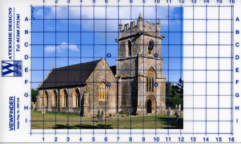
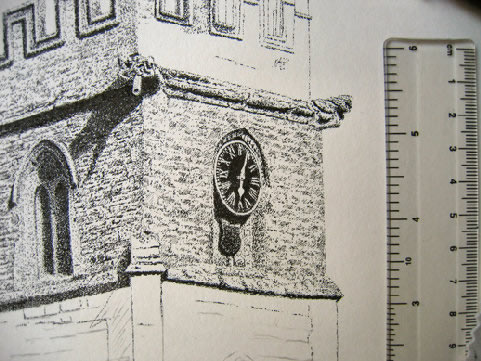
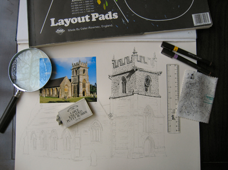
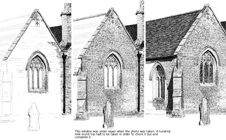
Where accuracy is required, I use this grid system. This can be used on location as well. Simply hold the see through grid at arms length and locate the key points. Photo’s can often hide details in shadows and bright highlights.
Draw your own grid onto layout paper (thin paper) to enlarge the image – the larger the squares, the bigger the picture.
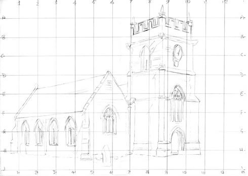
Now transfer your best lines from the layout paper to your cartridge paper. You do this by using transfer paper, (this is similar to carbon paper except that it transfers a pencil mark instead of ink) and a sharp hard pencil. Make sure the transfer paper is face down onto the cartridge paper. Place your layout drawing on top and then simply trace over your best lines. When this is completed, add the extra details lightly to your drawing on the cartridge paper, using an HB pencil.
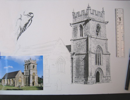
Start with the clock first because if this goes wrong it’s easy to start again. The actual size of this clock face is just 21mm high.
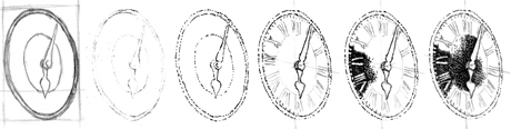
| 1.Layout paper. | 2.Transfer lines/marks. | 3.Ink over, then erase the transfer lines. | 4.Draw the numerals | 5.Ink in using tiny dots. |
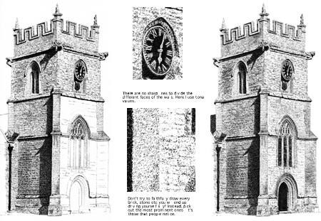
Be sure to get your drawing right before applying ink – it’s easy to erase pencil marks, but not ink. For this particular clock, making white hands and numerals to ink around is best – they are easier to see than a grey pencil mark. The numerals must be at the same angle of perspective as the brickwork the clock is on. The tighter the ink marks are packed together, the darker the tone. The more spaced out they are, the lighter the tone. Remember the clock is higher than your eye level and at an angle.
WORKING INDOORS (with imagination) FROM A PHOTOFeel the warmth of the sun and a gentle breeze, Hear the songbirds singing in the trees. Smell the fragrance of some nearby flowers, A peacefull place, we can sit for hours. Working this way is from the soul, And helps us reach our final goal.
The obvious can elude me sometimes, so a fresh look next morning can be a real eye opener. I often find things that have been overlooked.
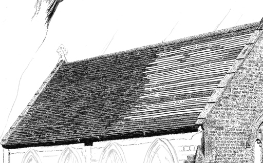
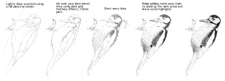
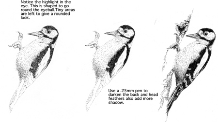
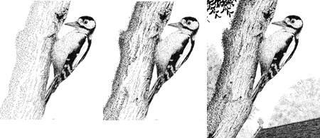
Be sure to draw each tile in the direction it is laying. When I became bored with bricks, tiles etc, I turned my attentions to the Woodpecker.I have used artistic licence to enhance this picture and add depth. Things like T.V aerials, telephone wires etc, I generally leave out.
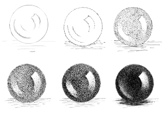
Example of how to make things look round.This is just lots of tiny dots.
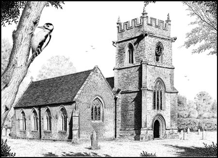
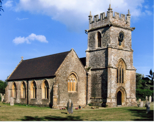
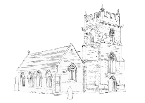
“ST. PETER’S CHURCH”
Chetnole, Dorset.
If there was anything that’s not clear to you, please e-mail Mike. Equally, if you have any tips to help make Mike’s website or the tutorials better, He would be delighted to hear from you.
wow that was really cool
everytime its getting more interesting
love how the dots create texture to the picture
it really looks beautiful
Hi Mike,
Your work is beautiful.
I am a high school art teacher. I purchased repidograph pens (through the school budget) black plus colors. Now I’m stuck. Got any suggestions as to what the students can create with these pens in the fall? Sincerely yours, Wayne
Thank you for leaving your comments on Mike’s work.
I am sure he would love to hear from you.
Please be sure to visit his website and drop him a line.
His website address: http://www.mikebudden.co.uk/
Thanks again!
– Ralph
I’m just new to pen & ink, well to any art really. I belong to a, “Healing With Craft Program,” and were just starting with the pen & ink. I’m working on an old barn picture. I’m glad I found your site, because I would like to also start a project at home
Thanks for all this information Helen
Thank you for the lesson! I enjoyed it.
Very nice, lesson I draw quite often, but I feel that my skills are not improving too much.