About Barbara Fox
Barbara has achieved a tremendous following on both the national and international level as a watercolor painter with a vivid and unique style.
Her paintings have been featured in solo and group exhibitions in museums and galleries throughout the United States, including the Phillips Museum of Art in Lancaster, Pennsylvania; the Millicent Rogers Museum in Taos, Mexico; the Salmagundi Club New York City; The Neville Museum in Green Bay Wisconsin; and the Pittsburgh Center for the Arts
Barbara is a signature member of the National Watercolor Society, the International Guild of Realism, the Pennsylvania Watercolor Society, and the Northeast Watercolor Society, among others.
She has been published in the major watercolor publications Splash: the Best of Watercolor Painting, and Secrets of Watercolor Masters. Barbara has been a featured artist in the leading national art magazines American Artist and Watercolor Magic.
Barbara is represented by the Oxford Gallery, 267 Oxford Street, Rochester, NY 14607
Visit Barbara’s Websites Today:
Perfectly Pink Watercolour Painting Demonstration
(Click Images for Larger Views)

Here is the photo I used for reference; taken many years ago with my SLR camera.

Step 1 Pencil Drawing
I did a quick, pencil drawing of the rose on watercolor paper.

Step 2 Color Field
Each petal of the rose is painted separately using Permanent Rose, Opera, Winsor Violet, and Cobalt Blue. Remember to paint every other petal, so the paint washes won’t run into each other.
I paint the petals in one of two ways:
A. I wet the area of the petal with plain water, then add pure colors, letting the water do the mixing.
see below

OR
B. I painted the petal with Permanent Rose, then immediately added a little Cobalt Blue along the top edge while the paint was still wet.
see below

I painted the background using technique A., getting the paper very wet, adding the color, then tipping the paper to let the colors flow together. I don’t try to paint the whole background at once. Here you can see that I painted the background in 2 sittings. This is the big advantage to doing a splotchy, washy background.

The leaves are painted with Sap Green, Viridian, Peacock Blue, and Alizarin Crimson. Plus, I mixed Alizarin Crimson and Viridian to get a black.

Step 3 Shadows and Texture
The cast shadows are added to the flower petals, using Winsor Violet with a bit of Opera here and there. Remember to paint every area separately, so the colors don’t bleed.

Cast Shadows on the leaves are Black, Viridian, and Prussian Blue.
Suddenly the rose has dimension! I also added some detail texture to some of the petals, but that is done after the shadows are completely dry.
see below


Step 4 More Layers/ Richer Colors
I added another layer of pink color over the rose, using Opera and Permanent Rose. Again, painting each petal separately.

The last layer of pink wash was not painted in a flat manner. I tried to follow the gradations of light and dark I saw on the photograph. I also didn’t paint the edge of the petal with the second layer. This gives the flower more shape and dimension.
I added a very dark wash to the background using Viridian, Peacock Blue, Winsor Violet, and Prussian Blue, with a few dabs of Opera, and some black (Alizarin Crimson and Viridian) lines added to the wet wash to give the impression of foliage.
I washed water over each leaf. This “melted” a bit of the heavy pigment and diminished the contrast a little. Too much contrast draws attention, and I don’t want the leaves to be the center of interest in this painting.
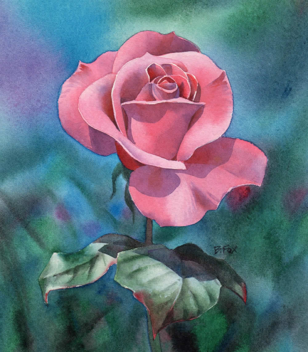
The pinks and cool blues and greens balance each other very well in this painting. The painting as a whole is quite dark, but the vibrant pink color, and the value contrast of the rose make it the center of attention.
There are 3 simple ways to make something stand out in a painting:
Value contrast – Shadows!
Lines around the subject -you get this very subtle effect when each area is painted seperately.
Complementary colors – The pink flower against the greenish background.
If something is inclear in this demonstration, please let me know by leaving a comment or sending an email.
Happy Painting!
Perfect color! It’s much more than the color of the original flower in your photo. You have an amazing hands, how I wish I can also have a talent when it comes to color combination. Keep that talent and treasure it, that’s a gift given to you.
This is a beautiful painting. I love all mediums that are done well, but watercolour is so fresh and pure. This artist handles it very well.
My thanks.
great finishing.really beautiful than the original one.very good finishing and color combination.
Gorgeous. Thank you for explaining everything so clearly! I’m going to use this lesson as a reference for a very long time!! ??