All Illustrations for a theory of light and shade are by Sheri Doty accept for Manet’s painting “The Railway” showing an undefined light source. Before you undertake your practice of the use of light and shade in your art you need to understand the significance that light and dark contrast has in making a painting or drawing visually believable.
Value is the term used to describe light, gray and dark tones.
Johannes Itten wrote “the contrast between light and dark is one of the most expressive and important means of composition.” Value contrast can be encountered in both colorful and non-colorful art renderings.” All neutral tones from white, black and all the gray tones between are called achromatic, meaning having no color. All tones that have some color are call chromatic. When investigating art in all its components, you must consider the relationship of value to other art elements, color, line texture and shape. All these elements must exhibit some value contrast in order to remain visible.
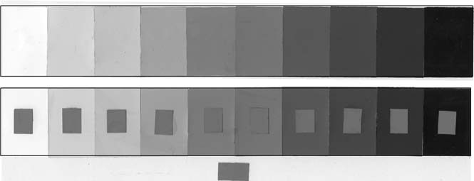
A simple Value Scale shows figure-ground relationships
Figure-Ground is the condition in which backgrounds tone or hue changes the visual impact of the figure resting on it. The same hue or value appears to be a different depending upon the contrast of tone or hue of the background upon which it is placed. Conversely, two different tones or hues appear to be the same when placed on contrasting grounds. Each will have an impact on how believable your art will be perceived by the viewer. Most people have difficulty perceiving “figure-ground” relationships. When the same medium toned figure is placed on varied light and dark backgrounds, it will be perceived to be as a different value.Example: When a medium gray is placed on a near black background, the mid-gray tone appears very light. When the same gray tone is placed on a near white background, it is perceived to be very dark. But when a mid gray tone is placed on a similar value background, the contrast is minimal. Note how the same mid-tone value patch looks different when placed on backgrounds of contrasting values.
Chiaroscuro
Value describes volume and depth of space In Europe artists of the Renaissance were concerned with showing depth and volume in opposition to the artists of the Middle or “Dark Ages.” Men of the Renaissance considered their time period to be the Age of Reason and rebirth of artistic and mathematical achievements. Renaissance artists manufactured the term “Chiaroscuro” to describe how light and dark can imply depth and volume. The word Chiaroscuro is a combination of two Italian words that mean light and dark. (chiaro (clear, light) + oscuro (obscure, dark) Atmospheric or Ariel perspective was one of the artistic strategies used in the study of Chiaroscuro during the Renaissance. (Atmospheric or Ariel perspective is covered in depth in the section “Objective Color Harmony”.)
Chiaroscuro and the Illusion of creating intuitive space.
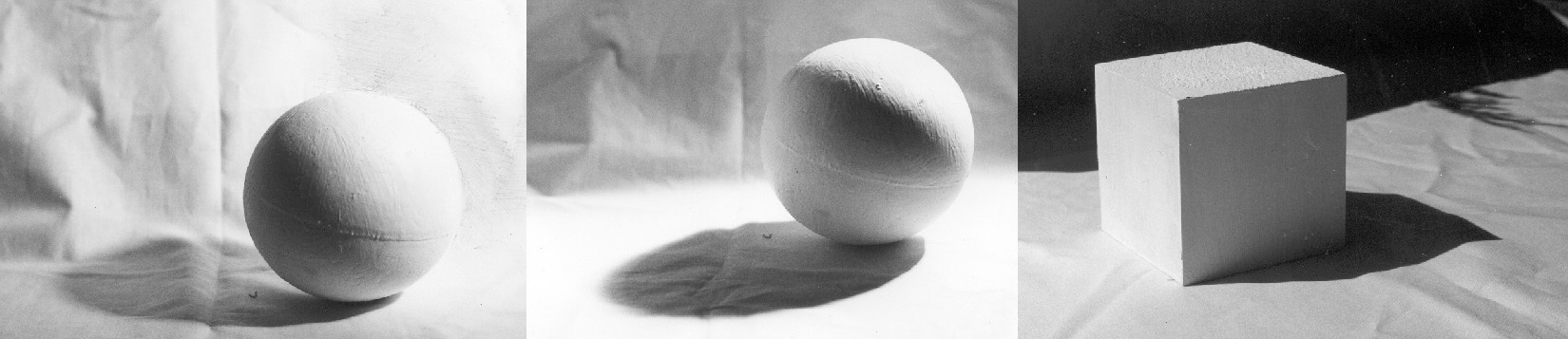
One of the most used and useful applications of value is creating the illusion of volume and mass on a two dimensional surface. When a mass is exposed to light, a solid object will receive more light from one side than another when that side is closer to the light source. A spherical surface demonstrates this as an even flow tone from light to dark. A cast shadow is created when the source of light is obstructed by the sphere. An angular surface shows sudden contrast of light and dark.
Intuitive Space is merely a trick the artist uses to create depth on a two dimensional surface.
“Intuitive space” is merely the illusion space created by using artistic methods to trick the viewer into seeing depth, volume and mass on a two dimensional surface. Intuitive space is sensed or ”felt” on a two dimensional plane. Intuitive methods of space control include overlapping, transparency, and other applications of spatial proportion. In a “Theory of Light and Shade” I will show how to create intuitive space by using “Light Logic”.
Light Logic refers to how light interacts with objects. Light Logic is the term Betty Edwards uses in her book “The NewDrawing on the Right Side of the Brain”
Light Logic and the Rendering of Three Dimensional Objects onto a Two Dimensional Surface.
You will make your art more believable when you keep these basics in mind.
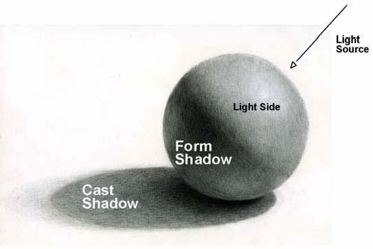
A Light Source and Shadows
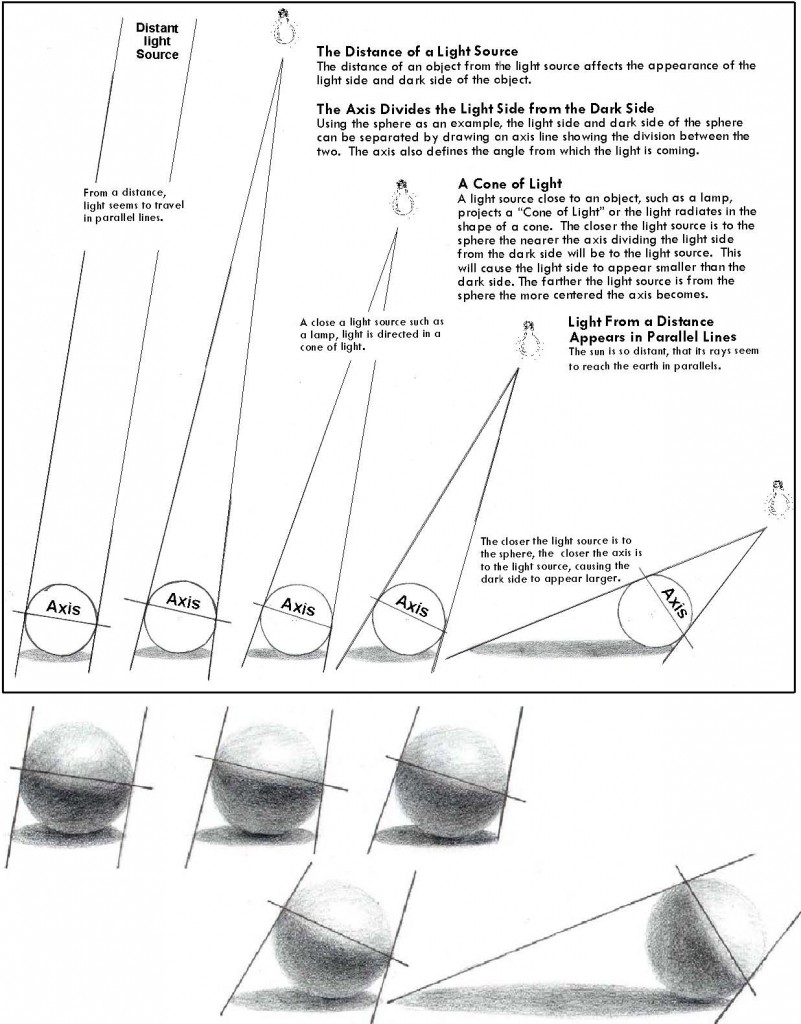
A light projected onto an object or figure creates lights, darks, and cast shadows. Your source of light may be the sun, the moon, a light through a window or an artificial light. When several light sources are present the light and dark tones vary and are less predictable. To simplify the study of light and shadow in this first section, I will use only one light source.
Two Kinds of Shadows
There are two kinds of shadows that occur when one light shines on an object, a cast shadow and a form shadow.
Cast Shadow
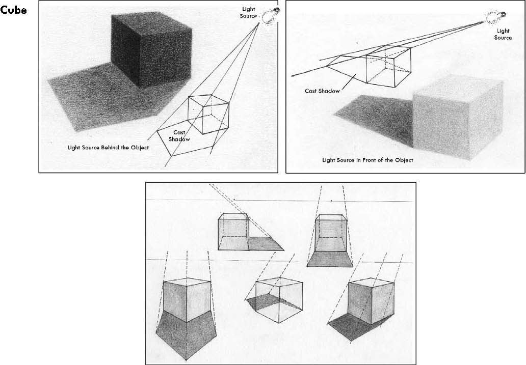
When an object blocks a light source it casts a shadow. A cast shadow is not a solid shape but varies in tone and value. The farther a cast shadow is from the object which casts it the lighter and softer and less defined becomes its edges.
Form Shadow
A form shadow is the less defined dark side on an object not facing the light source. A form shadow has softer less defined edges than a cast shadow. Form shadows are subtle shadows essential for creating the illusion of volume, mass and depth. The changes in form shadows require careful observation – quinting at the subject to see value definition affected by figure-ground making value relationships clearer.
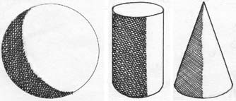
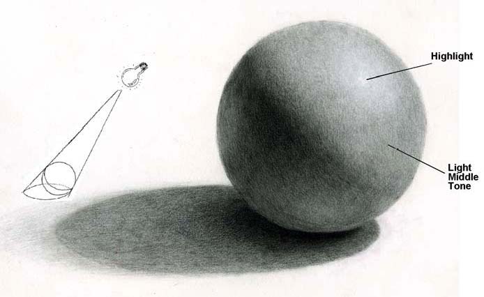
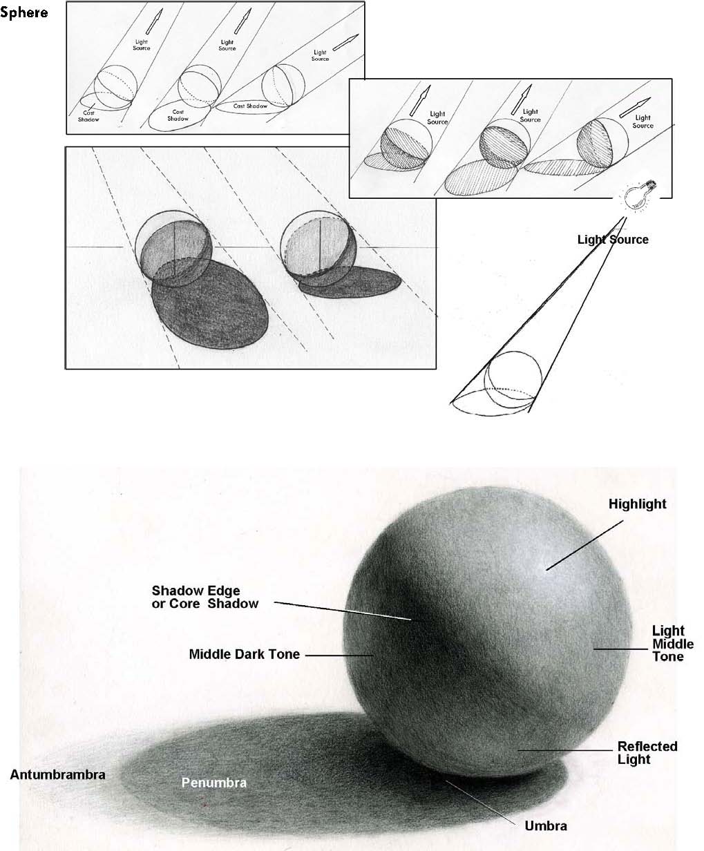
A Light Side and a Dark Side on Round or Circular Surfaces
When one light source is present, I was taught the dark side is “always”darker than the light side of the object and the light side is “always” lighter than the dark side. Establishing a definite light side and dark side makes round objects appear round and defines the form of an object accurately. Use this simple trick to make your artwork more true to life, separate light tones avoiding figure-ground confusion.
THE LIGHT SIDE IN TWO PARTS
Highlight
The lightest spot or streak is where the light strikes the subject in exactly the middle of the light side between the shadow edge and the edge of the object. A highlight can be shinny and crisp on a glass or metallic surface, or fuzzy and muted on a dull or textured surface.
Light middle tones
Note, to avoid confusion, “always” keep the values on the light side lighter than the values on the dark side. In reverse, the values on the dark side are darker than the values on the light side. It’s the middle tones on either side that confuse the artist’s eye in value relationships
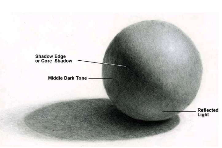
The Dark Side in Three Parts
Form Shadow in Three Parts
“Shadow edge” or “core shadow”
The edge where the light is blocked from the light source is the darkest value on the dark side. The core or darkest value blends into the middle tones from the shadow edge on round subjects.
Dark middle tone
The variable values blended form the shadow edge on the dark side. Again, the dark middle tones are darker than any values on the light side. The human eye can trick the brain into believing the lightest values on the dark side are the same as the darkest values on the light side. If the artist is confused about lights and darks, the rendering is less understandable.
Reflected light
If the object being painted is sitting on a white table, the light from the table reflects back onto the object and makes the shadow side lighter. If the object of the painting is resting by something black or dark, the middle values will become a dark reflection. The concept also holds true when the object of the painting is sitting on a colored surface. If the reflected light is reobject.
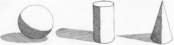
Cast Shadows
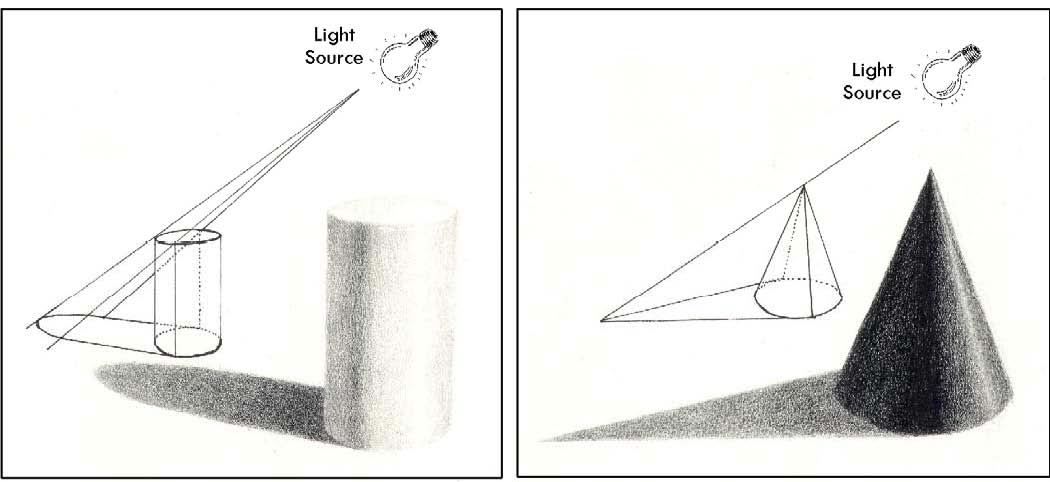
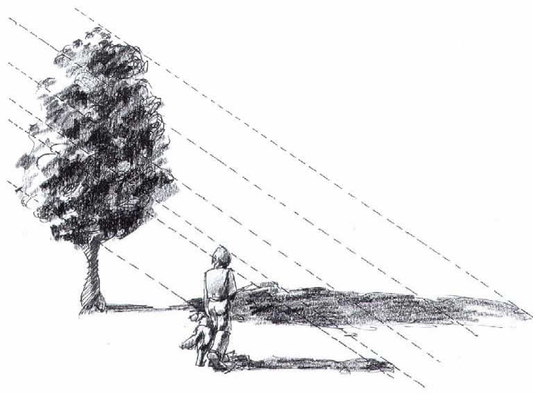
When the source of light is blocked by an object it casts a shadow. The length and shape of the cast shadow depends on the placement of the light source. Long shadows are cast from a side light source (as from the sun in late afternoon or early evening), and short cast shadows are cast from over head (as from a noonday sun). The shape a shadow casts depends on the shape of the object casting it and how close source is to the object.
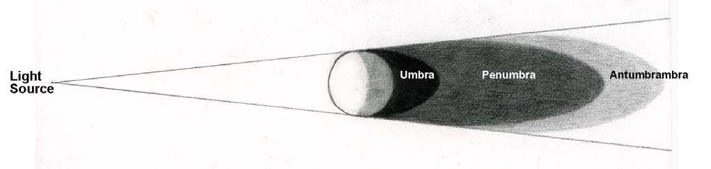
CAST SHADOWS IN THREE PARTS
The vocabulary used to describe cast shadows in art come from shadow descriptions in astronomy. The umbra, penumbra and antumbra are the three distinct names given to the description of shadows cast by heavenly bodies. The umbra is the darkest part of a shadow considered the absence of light. The penumbra is a lighter outer shadow where the object is only partially obscuring the light. The antumbra is more obscure. When it is visible it seems to extend out from the penumbra in a lighter and less distinct way.
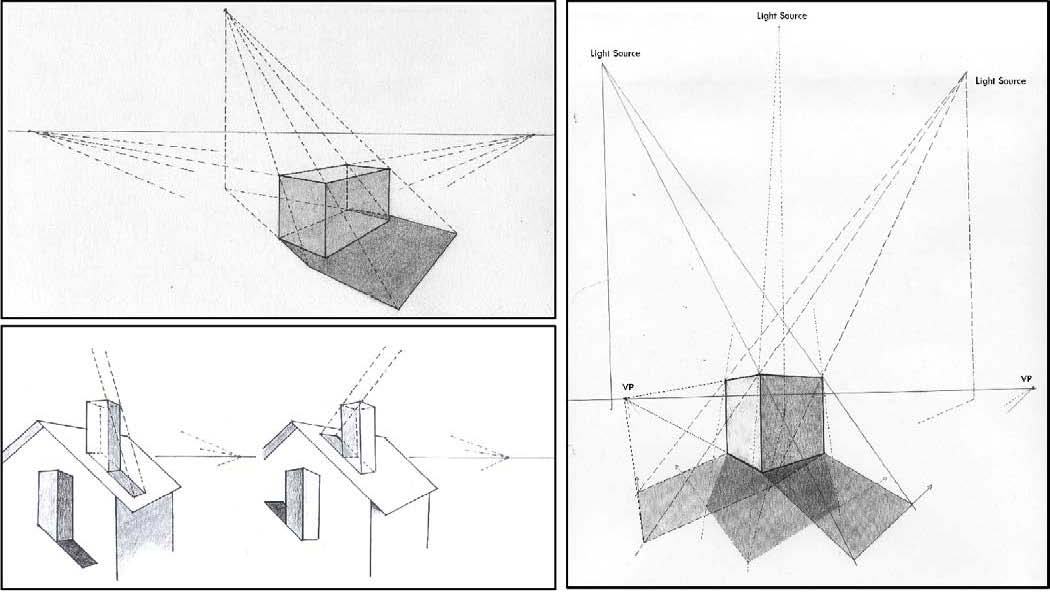
Light Source, Cast Shadows and the Axis
Cast Shadows The Sphere
The Cube
The Cylinder and Cone
More on Cast Shadows
Too many complex cast shadows can be confusing. Such objects can be rendered by blurring the edges.
Daylight and Cast Shadows
Cast shadows of irregular shapes and in natural sun light are open for interpretation because of the constant changing sunlight: As you work on location, the sun will continue to advance and change what you are drawing. Note the place you would have the sun be positioned, and keep that constant to avoid a confusing spread of shadows. The nature of shadow is affected by weather, sunlight, moonlight, or artificial light.
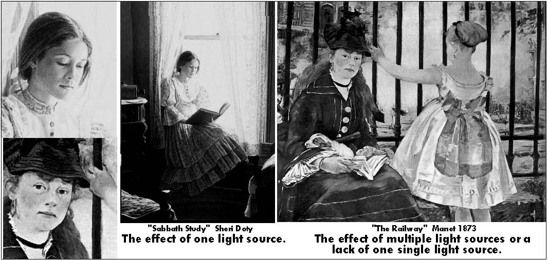
Multiple Light Sources or an Undefined Light source
Multiple light sources or an undefined light source minimizes the gradation of values and flattens the sense of volume in three dimensional objects. Because of this lighting affect, artists such as Manet painted colors in flat areas neglecting the use of one light source to create shadows. An undefined light source causes a sense of shallow space. Some art critics believe this sense of shallow space to have paved the way for “nonrepresentational” uses of value and color.
Manet’s Painting, “The Railway” shows value contrast in composition, but the sense of shallow space is emphasized by a lack of a single light source.
Objects Have Light, Medium or Dark Values
Objects have an allover light, medium or dark quality. To make your representation more believable, you should take into consideration the light or dark value of each object. Before you render details, block in the value characteristics of each object. Using this strategy will save you time and achieve a more realistic result.
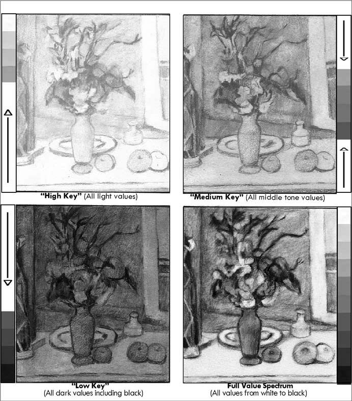
Value Schemes and Mood
You create a sense of mood or interest depending on the combination of values present in a work of art. When value contrast is limited to a small range of tonal variations the result is one of understatement and calm. “High Key” is the term used for a light value scheme. All middle tone values are in a “Medium Key” range.
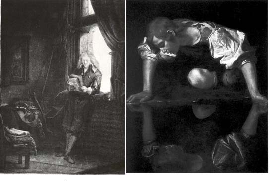
And “Low Key” refers to an allover dark toned value scheme. Sharp value contrast evokes strong emotions in the viewer suggesting drama or conflict. Extreme value contrast in a value scheme refers to a style of chiaroscuro called “Tenebrism”.
Tenebrism – Violent Chiaroscuro
In the 17th century, a group of painters instituted the so called “dark manner” of painting. They were inspired by Michelangelo di Caravaggio. Rembrandt perfected this manner of Chiaroscuro. Tenebrism made value an instrument of strong contrast that lends itself to a dramatic and even theatrical style of using light and dark contrast. The tenebrists were interested in peculiar lighting causing mood or emotional expressionism. The deviation from standard light conditions into unexpected lighting locations creates unusual and special effects. This style is used today by photographers.
The analytical study of Chiaroscuro in the art of today
Using chiaroscuro to create excitement and interest in composition is a modern concept. Artists of the Renaissance were concerned with showing depth and volume on a two dimensional surface. The expression of light and contrast in old and new masterpieces reveal the continued importance of Chiaroscuro in art.
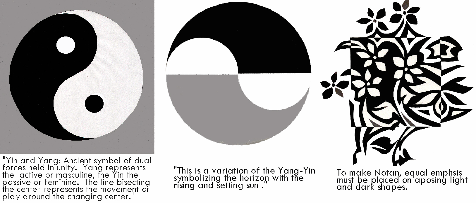
Notan
Notan is a Japanese word meaning dark-light. The principle of Notan is the interaction between positive (light) and negative (dark) space. This interaction is confirmed by the ancient Chinese symbol of Yin and Yang. This is represented by mirror images of one black and one white shape revolving around a center point. The positive and negative areas make a whole through a unity of opposites that are equal and inseparable. In Notan, opposites complement and do not conflict.
“An understanding of Notan traditionally has been and will be a requirement for mastery of any field of art. It enables the artist to compose a work in which all the parts relate to create a unity of visual organization, impression, or pattern. Notan enables the artist to achieve a Gestalt – or more simply to create a design.”Notan The Dark-Light Principles of Design by Dorr Bothwell and Marlys Mayfield
Lao-Tse wrote a poem that to me simply states the Essence of Notan:
Thirty spokes meet in the hub, but the empty space between them is the essence of the wheel.
Pots are formed from clay, but the empty space within it is the essence of the pot.
Walls with windows and doors form the house, but the empty space within it is the essences of the house.
The Principle: Matter represents the usefulness Non-matter the essence of things.
Poem taken from Johannes Itten’s book Design and Form, Revised Edition Basic Course at the Bauhaus and Later, John Westly & Sons, INC, page 13
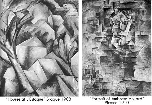
Value as Pattern
Controlled shallow space is illustrated by the early cubists such as Picasso and Braques. Their paintings are taken from realistic subject matter and abstracted into unified flat tonal planes. The planes are shaded individually with the semi-illusion of space with no light source. Later, each plane takes on characteristic value combined with other planes with the same style of value pattern. This produces a carefully conceived two dimensional pattern of light and dark values. The shallow space develops a three dimensional effect through the characteristics of the advancing and receding values.
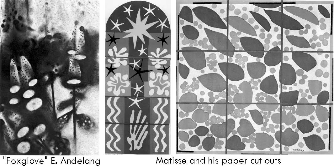
Decorative Effects of Light and Dark Contrast
Artists using the decorative effects of light and dark contrast ignore the use of the conventional tools of light logic all together. When light effects appear, it is often based on the total design of the artwork.
Compositional Functions of Value
Today most artists use value as a vital tool in pictorial composition. Value contrast is an intrinsic factor in pictorial organization, in showing dominance in design, creating two dimensional patterns, establishing mood and producing spatial unity. The effectiveness of a work of art or design is in large measure based on the use of value.
Resource Material: Ideas for this section came from my own experience, education and observations; “Basic Perspective for Artists” by Keith West; “Perspective Without Pain” by Phil Metzger, North Light Books 1988; The Basics of Drawing by Parramon Ediciones Editorial Team’ Barron’s Educational Series 1994; The Practice and Science of Drawing, by Harold Speed, Dover, first published in 1917 by Seeley, in London, reprinted by Dover,1972; Art Fundamentals Theory and Practice – Second Edition WM.C. Brown Company, Publishers/Dubuque, Iowa 1968 by Ocvirk, Bone, Ssinson and Wigg; Design Basics Fifth Edition, by David A. Lauer and Stephen Pentak, Wadsworth-Thompson Learning
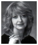
Sheri Lynn Boyer Doty CPSA -Biography
Sheri Doty received a B F A degree in 1972 from the University of Utah with a painting and drawing emphasis. Having experimented with non-representational styles during her student years, Sheri preferred classic realism as thought by professor Alvin Gittons. He and the professors, under whom she studied, emphasized strong drawing and painting skills. Sheri is a faculty member of Salt Lake Community College and Peterson’s Art center where she teaches Fine Art and Design.
Sheri’s paintings have earned her awards in regional, national and international art exhibitions and invitational shows including purchase awards and permanent museum acquisitions. Sanford Corporation has used her artwork to showcase its PRISMACOLOR colored pencil product line internationally. Sheri is a charter member and signature member of the Colored Pencil Society of America [C.P.S.A.].
Sheri’s artwork has been published in numerous books including The Encyclopedia of Colored Pencil Techniques by Quarto Publishing, London England;Most of The Best of Colored Pencil series by Rockport Publishers, Creative Colored Pencil Techniques by Rockport Publishers, Creative Colored Pencil Portraits byri’s art work is included is Rockport Publishers and The Best of Portrait Painting by North Light Books, Dear Sisters by Covenant Communications Inc. Sheri’s artwork is published on book covers, in newspapers, periodicals, and exhibit catalogues.
People have been known to say, “She possesses a unique ability to paint the breath of life into her subjects – a gifted talent.” Because Sheri expresses not only the likeness of her clients but also their lifestyle, her portraits are in high demand. Sheri has also has prints and greeting cards on the market.
Sheri Says:
“The art professors under whom I studied had us draw and paint from live models and “open air” studies, not from photographs. To truly see and paint a subject, I need to see it from all angles. The human eye sees so much more than what is pictured in a photograph. I am glad of the rich ridged training I received from my teachers. I have married the use of photography and live studies to create my paintings. I take my own photographs as resource material employing a variety of ways to recreate what the human eye sees. My paintings are not exact reproductions, but an interpretation of life from my view as an artist.
“Thirty years of study and experience in this field has taught me that talent isn’t the reason for success in any endeavor. The keys to success are desire, perseverance and determination. But most of all, I depend on Father in Heaven’s influence. When I pray about what I paint, I can feel His help and guidance.”
This is a great, comprehensive article! Once you understand how light works and how to shade basic shapes, drawing more complicated subjects becomes much easier. Thanks for this info! .-= Miranda´s last blog ..How to Draw the Nose – Tutorial =-.
I’ve been searching for such an article for so long. You’ve outlined things in a way that will make it much easier to understand and render what the eye sees. Thank you.
dr. soni ekweresays
the lesson is an artistic antacid for a creatively constipated artist. it is well cherished
Gregg @ Oil Painting Beginnerssays
Great articles and Thanks a million for the visuals. I did a painting a while ago and had some issues with the shading. I really wish I had seen this article back then. Great stuff. Keep it coming!!! Thanks…
mysketchsays
basic knowledge of drawing is how to create light and dark sides of our object image and here I can get that knowledge -.
Olasays
I was actually looking for a word to describe light and dark as a concept and i think you article shed a little light on the darkness. Do you have any other word to describe light and dark as a concept. Thanks
bsunandsays
A very comprehensive article. Many of my vague concepts were cleared.
thugz09says
tried a lot to understand light n shade…..this article made me clear about many confusions i was goin thru!!! thnks a lot [o_0]
lynnesays
This is a brilliant article Sheri. My son is currently studying art at A-Level and doing brilliantly. Sketching is his favourite side of art and this will be invaluable.
saaidsays
Great stuff! keep up the good work, ilook forward to reading more of your articles
arvind charysays
thank u for ur explanation on light and shade.being a fine art student am have been confused on Chiaroscuro.his article made me clear about many confusions.thank u once agail Sheri.
Rosesays
Feel like I am in class with my teacher again. 😉 Thank you for this great lesson.
u s kakodkersays
i am quite new to painting, and am always scared of color combinations not knowing if one chosen would really work. this article has developed my understanding of paint and its shades. immense gratitude and thanks to the author for putting it simply to dummies like me.
Ditirosays
This is absolutely informing. I had a great time with this lesson. I struggled a lot with how light hits an object, particularly with the angles of light. Thank you.
Jahansays
I loved the lesson. I bookmarked for future referencing. I’m new to drawing and art; but, I’m not wasting any time to understand every viable principle in art to achieve great and realistic work. Thank you!
Ronsays
Sheri, I have never seen drawing explained quite like this. I love how you talk about the different angles of light and shadows.Again Awesome! Thank you for the awesome article!
Mattsays
Perhaps the most thorough explanation of value and it’s importance that I have found. In my opinion, value is the most important element of art.
dianesays
thanks for the help! wonderful article. 🙂 i have now my assignment in drafting.
I like your lesson on Light and Shadow. I need to find more lessons and learn to improve my drawing skill on internet.
Bill Sanderssays
I’ve been an art instructor and illustrator for more than 20 years. What is your source for the impressionist theory of painting flat surface planes? Value has always been a vital tool and multiple light sources were not a big concern with impressionist painters as a group. Impressionism developed from the idea of using tonal shapes reflected on the retina of the eye versus the more sculptural painting and drawing of most Renaissance Masters whose works depicted form as 3D objects identified in space by touch and ‘sympathetic touch memory’. Impressionists identified every tone shape as a light and assigned a color value to the brightest tint and deepest shade. Color temperature and chroma exceeded value and volume as a painting concern for most impressionists. They were interested in depth as the relationships of color value shapes juxtaposed in space. Light source, like value is inseparable from representational works and was unavoidable, just not a primary concern.
Vladimirsays
This is really a good article! Very impressive and helpful.
Best Regards, Vlad
Johnsays
Brilliant article, I’ve bought a few recommended books on the subject, but this made things much clearer to me, thank you 🙂
Stanley Srokasays
You have laid the cornerstone upon which the building of all art rises. When this is understood, really, then all doors of creativity and confidence are opened; freedom of ones expressions now unfold.
Rabanne Jsays
Thank you do much for sharing! Great article and it really helped me.
nayabsays
I would like to ask you a Q. What do you think it is that the quality of the light effects the value of color?
Suvidha Bajpaisays
Beautiful article, nice presentation.
Teresasays
Excellent tutorial on light and shadow! Thank you.
Mikesays
This website is known as a walk-by means of for all the info you wished about this and didn’t know who to ask. Glimpse right here, and also you’ll definitely discover it.
kedarnarthsays
its very nice article,simple and clear.. thank u so much
This is the best article I’ve read so far, I wish they would explain the subject like this in art school…
Thank you so mach for this one.
George Hallsays
I’m late to the party, but in case you’re reading this, THANK YOU!
jerisays
I stopped water coloring because I was making some great pictures, but I didn’t really understand how I was doing it. I decided to use graphite to train my eye and mind–wow, was it hard to get any information about how to observe what happens to light. I’d intuitively got the dark side, but yikes on the light–missing link was the distance of the light source. Thank you, thank you.
giuseppesays
sorry. you just share some images about shade. U didn0t explain or teach to people the rules behind shade on perspective, or axonometry.
rupalisays
it was really of great help, felt like i was in a drawing class. Thank u.
Nivishasays
This is what we call a complete art class Its actually better than my college lectures..Thankyou so much.You are a great artist 🙂 Regards
KNOWLEDGE IS ALWAYS VALUABLE AND MUST CONTINUE ITS TRAVEL FROM ONE TO ANOTHER….. EDUCATION MUST BE FOR ALL ON “EQUAL RIGHTS” GROUNDS. THANKS TO ALL OF YOU.
iransays
thank you a lot .
Mullhollandsays
Uh, “Men of the Renaissance”? How about “Artists of the Renaissance” instead?
beside been pretty you are kind and virtue… because you are an excellent teacher ..!!
Brendon Peterssays
I now know a fancy word to describe extreme light and dark, Chiaroscuro! This was a very comprehensive and completes my understanding of values, light, dark, medium shading in relationship to objects and people.


This is a great, comprehensive article! Once you understand how light works and how to shade basic shapes, drawing more complicated subjects becomes much easier. Thanks for this info!
.-= Miranda´s last blog ..How to Draw the Nose – Tutorial =-.
This is a wonderful article…. thanks for sharing…
very complete article. Thank you. Judy
This is a wonderful article, full of information. Good for beginners and also as a reminder for the rest of us. 🙂
Thanks.
.-= Jo Castillo´s last blog ..Another Hunting Sketch =-.
Great article, so much information,Thank you
it was very helpful
Thanks for this excellent article
I’ve been searching for such an article for so long. You’ve outlined things in a way that will make it much easier to understand and render what the eye sees. Thank you.
the lesson is an artistic antacid for a creatively constipated artist. it is well cherished
Great articles and Thanks a million for the visuals. I did a painting a while ago and had some issues with the shading. I really wish I had seen this article back then. Great stuff. Keep it coming!!! Thanks…
basic knowledge of drawing is how to create light and dark sides of our object image and here I can get that knowledge
-.
I was actually looking for a word to describe light and dark as a concept and i think you article shed a little light on the darkness. Do you have any other word to describe light and dark as a concept.
Thanks
A very comprehensive article. Many of my vague concepts were cleared.
tried a lot to understand light n shade…..this article made me clear about many confusions i was goin thru!!!
thnks a lot [o_0]
This is a brilliant article Sheri. My son is currently studying art at A-Level and doing brilliantly. Sketching is his favourite side of art and this will be invaluable.
Great stuff! keep up the good work, ilook forward to reading more of your articles
thank u for ur explanation on light and shade.being a fine art student am have been confused on Chiaroscuro.his article made me clear about many confusions.thank u once agail Sheri.
Feel like I am in class with my teacher again. 😉 Thank you for this great lesson.
i am quite new to painting, and am always scared of color combinations not knowing if one chosen would really work. this article has developed my understanding of paint and its shades. immense gratitude and thanks to the author for putting it simply to dummies like me.
This is absolutely informing. I had a great time with this lesson. I struggled a lot with how light hits an object, particularly with the angles of light. Thank you.
I loved the lesson. I bookmarked for future referencing. I’m new to drawing and art; but, I’m not wasting any time to understand every viable principle in art to achieve great and realistic work. Thank you!
Sheri,
I have never seen drawing explained quite like this. I love how you talk about the different angles of light and shadows.Again Awesome! Thank you for the awesome article!
Perhaps the most thorough explanation of value and it’s importance that I have found. In my opinion, value is the most important element of art.
thanks for the help! wonderful article. 🙂 i have now my assignment in drafting.
I like your lesson on Light and Shadow. I need to find more lessons and learn to improve my drawing skill on internet.
I’ve been an art instructor and illustrator for more than 20 years. What is your source for the impressionist theory of painting flat surface planes?
Value has always been a vital tool and multiple light sources were not a big concern with impressionist painters as a group.
Impressionism developed from the idea of using tonal shapes reflected on the retina of the eye versus the more sculptural painting and drawing of most Renaissance Masters whose works depicted form as 3D objects identified in space by touch and ‘sympathetic touch memory’.
Impressionists identified every tone shape as a light and assigned a color value to the brightest tint and deepest shade.
Color temperature and chroma exceeded value and volume as a painting concern for most impressionists. They were interested in depth as the relationships of color value shapes juxtaposed in space. Light source, like value is inseparable from
representational works and was unavoidable, just not a primary concern.
This is really a good article! Very impressive and helpful.
Best Regards,
Vlad
Brilliant article, I’ve bought a few recommended books on the subject, but this made things much clearer to me, thank you 🙂
You have laid the cornerstone upon which the building of all art rises. When this is understood, really, then all doors of creativity and confidence are opened; freedom of ones expressions now unfold.
Thank you do much for sharing! Great article and it really helped me.
I would like to ask you a Q. What do you think it is that the quality of the light effects the value of color?
Beautiful article, nice presentation.
Excellent tutorial on light and shadow! Thank you.
This website is known as a walk-by means of for all the info you wished about this and didn’t know who to ask.
Glimpse right here, and also you’ll definitely discover it.
its very nice article,simple and clear.. thank u so much
This is the best article I’ve read so far, I wish they would explain the subject like this in art school…
Thank you so mach for this one.
I’m late to the party, but in case you’re reading this, THANK YOU!
I stopped water coloring because I was making some great pictures, but I didn’t really understand how I was doing it. I decided to use graphite to train my eye and mind–wow, was it hard to get any information about how to observe what happens to light. I’d intuitively got the dark side, but yikes on the light–missing link was the distance of the light source. Thank you, thank you.
sorry. you just share some images about shade. U didn0t explain or teach to people the rules behind shade on perspective, or axonometry.
it was really of great help, felt like i was in a drawing class. Thank u.
This is what we call a complete art class Its actually better than my college lectures..Thankyou so much.You are a great artist 🙂
Regards
Excelente! Gracias
Me ha servido mucho
Muy completo e instructivo. Gracias
De nada! Mercedes…
awesome…thnx
KNOWLEDGE IS ALWAYS VALUABLE AND MUST CONTINUE ITS TRAVEL FROM ONE TO ANOTHER…..
EDUCATION MUST BE FOR ALL ON “EQUAL RIGHTS” GROUNDS.
THANKS TO ALL OF YOU.
thank you a lot .
Uh, “Men of the Renaissance”? How about “Artists of the Renaissance” instead?
Dear Sheri,
You are a great artist and a generous soul. Thank you so much for sharing these extremely important and useful basics.
beside been pretty you are kind and virtue… because you are an excellent teacher ..!!
I now know a fancy word to describe extreme light and dark, Chiaroscuro! This was a very comprehensive and completes my understanding of values, light, dark, medium shading in relationship to objects and people.
Informative and helpful